The Card component is created in my guide on Building Variant Card Components in Sitecore XM Cloud with Next.js.
Storybook is an excellent tool for developing UI components in isolation, and in this post, we'll walk through creating a new Story for the Card component in your Sitecore XM Cloud Foundation Head project. We will define three different versions of the Card component: Default, Small, and Large, with varying layout sizes and mock data.
If you haven't set up Storybook yet, check out my previous post on Integrating Storybook with Sitecore XM Cloud Foundation Head for a step-by-step guide.
Step 1: Create a Story File for the Card Component
Inside your Storybook setup, create a new file in your project, following a similar path to where your Card component exists. Typically, you’ll want to place it within a stories or components folder.
Let’s assume your project structure looks like this:
src/components/Card.tsxstories/Card.stories.tsx
In Card.stories.tsx, we will define the stories for the Card component using mock data.
Step 2: Import Dependencies and Define Metadata
First, import the necessary modules from Storybook and Sitecore JSS to ensure the component and fields are correctly typed:
import type { Meta, StoryObj } from '@storybook/react';import { CardWithImage as CardImage } from '../components/Card';import { ImageField, LinkField } from '@sitecore-jss/sitecore-jss-nextjs';import '../assets/main.scss';
Next, define the metadata (meta) for the Card component, which will be used by Storybook to render the component properly:
const meta = {
  component: CardImage,
} satisfies Meta<typeof CardImage>;

export default meta;
This block of code informs Storybook that the CardImage component is the one being used and provides the necessary type checks.
Step 3: Define Story Variants
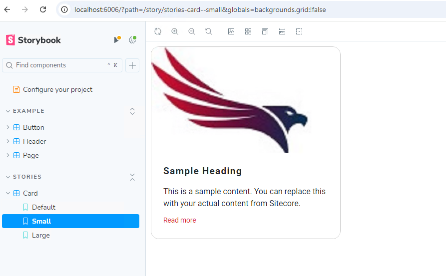
We’ll now create different versions of the Card component (called "stories") by passing in mock data. Each story represents a different size of the card (Default, Small, and Large), using mock heading, body, link, and image fields from Sitecore JSS.
Here’s the structure for our Default, Small, and Large stories:
 type Story = StoryObj;
 // Default Card
 export const Default: Story = {
   args: {
     params: {
       styles: 'col-lg-4', // Custom class for layout
     },
     fields: {
       heading: {
         value: 'Sample Heading',
       },
       body: {
         value: 'This is a sample content. You can replace this with your actual content from Sitecore.',
       },
       link: {
         href: 'https://www.example.com',
         text: 'Click here to learn more',
       } as unknown as LinkField,
       image: {
         src: 'https://via.placeholder.com/300x200', // Dummy placeholder image
         alt: 'Placeholder Image',
       } as ImageField,
     },
     index: 0, // Optional index property
   },
 };
 // Small Card
 export const Small: Story = {
   args: {
     params: {
       styles: 'col-lg-3', // Smaller layout
     },
     fields: {
       heading: {
         value: 'Sample Heading',
       },
       body: {
         value: 'This is a sample content. You can replace this with your actual content from Sitecore.',
       },
       link: {
         href: 'https://www.example.com',
         text: 'Click here to learn more',
       } as unknown as LinkField,
       image: {
         src: 'https://via.placeholder.com/300x200', // Dummy placeholder image
         alt: 'Placeholder Image',
       } as ImageField,
     },
     index: 0,
   },
 };
 // Large Card
 export const Large: Story = {
   args: {
     params: {
       styles: 'col-lg-6', // Larger layout
     },
     fields: {
       heading: {
         value: 'Sample Heading',
       },
       body: {
         value: 'This is a sample content. You can replace this with your actual content from Sitecore.',
       },
       link: {
         href: 'https://www.example.com',
         text: 'Click here to learn more',
       } as unknown as LinkField,
       image: {
         src: 'https://via.placeholder.com/300x200', // Dummy placeholder image
         alt: 'Placeholder Image',
       } as ImageField,
     },
     index: 0,
   },
 };
Step 4: Running Storybook
Once your story is defined, you can launch Storybook to visualize the different variants of the Card component. Run the following command in your terminal:
npm run storybook Storybook will start on http://localhost:6006. You should see the Card component rendered with three variants: Default, Small, and Large. Each will show a mock card with a heading, body, link, and image.