
By admin • May 24, 2025
The idea for the InfoMessage Wrapper came about while we were building new components and variants in Sitecore XM Cloud. We often use variants and rendering parameters to provide flexibility to content editors - such as enabling dark mode or using background colors for SVG icons. However, we noticed that even our QA team struggled to understand which variant should be used or why certain SVG icons weren't displaying correctly.
So we started thinking about how to provide more context to editors in Sitecore Pages. That's how the InfoMessage Wrapper was born.
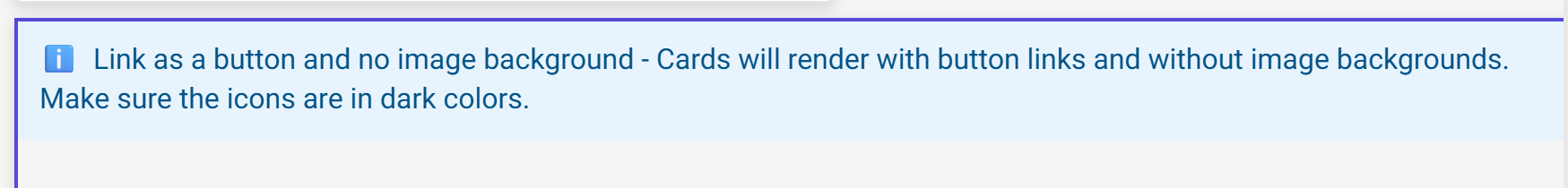
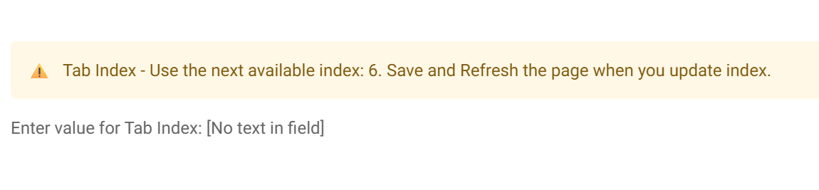
During its evolution, it grew to support warning messages and even critical messages. The screenshot below is from our "Dynamic" Tab Component for XM Cloud (stay tuned for a post about it!).
Simple Implementation
The implementation of the wrapper is simple. Just wrap your component, add a message parameter, and choose if it should be critical/warning or default. Here's how to use it:
<InfoMessageWrapper
  isEdit={sitecoreContext.pageEditing}
  message="Link as a button and no image background - Cards will render with button links and without image backgrounds. Make sure the icons are in dark colors."
>
  <CardGridComponent {...CardGridBackendProps} />
</InfoMessageWrapper>
Source Code
You can find the complete implementation in these files:
- Component Implementation: InfoMessage.tsx
- Styling: InfoMessage.module.scss


